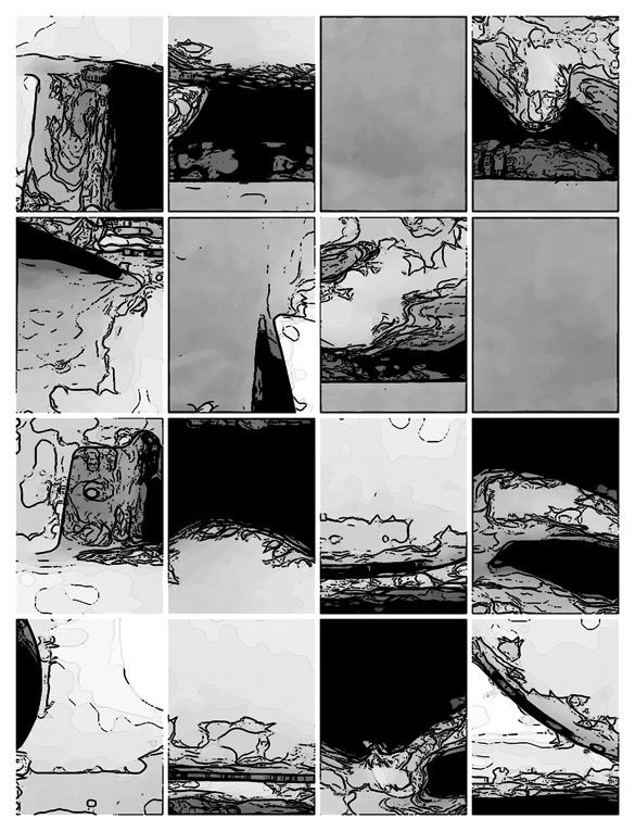
i won't say either is "better" than other -- each version provokes their own mood & narrative.
i'm a big fan of b & w & g, and you got some nice greys, it's striking how differently (yet essentially the same) each application operates -- and i'm glad you included both versions.
much of my bias for b & w & g comes from my love of photocopying & the example here would work very well if copied properly onna good machine & it's also a reproduction cost thing, photocopying being rather inexpensive.
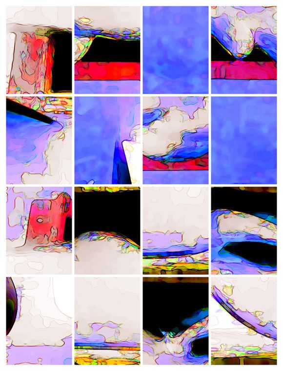
but i must say, even tho i'm trying to avoid value-judgements, that the color piece is just drop-jaw strikingly stunning -- the use & choice of color done up with a keen eye, good sense & a deft hand. it's feelgood city & the retinal absorption of those organic lines & colors trigger a release of pleasant brain-chemicals in this viewer's headbone.
all that said, have you considered a panel by panel graduation from b & w & g to the full color?
black and white is instant abstraction, i prefer it much more. it leaves more to be imagined. the colors are too forceful, authoritative. there is a binary between representational and abstract that is much more murky in the black and white version.
(Mon niveau d'anglais est trop mauvais je parle donc en français) Je préfère la version noir/blanc. j'aime les cases grises qui déséquilibre l'histoire. c'est très interressant. Au fait, pour mes études, je suis en train d'ecrire un mémoire sur la bande dessinée abstraite. je me souviens que vous avez le projet de publier une anthologie de la BD abstraite. j'aurai voulu savoir où en était le projet. Merci
I like the b&w one quite a bit. The colors in the other version looks like haphazardly applied Photoshop filters (in fact, I'm 99% sure that's what they actually are, though I guess it could've been painted that way).
Umm... no, it's not haphazardly applied Photoshop filters (and actually--this is not a rhetorical question--I'd be really curious to know what Photoshop filters you are thinking about, I'd like to use them). Admittedly, the image was manipulated digitally a bit, but after the coloring stage. And thanks, everybody!
Sorry, no offense meant, just an honest criticism. I've quite enjoyed browsing through your comics here, and I'm frankly excited beyond belief that someone is exploring so thoroughly the long un-mined area of abstract comics. I've always felt -- maybe somewhat perversely -- that Cornelius Cardew's graphic score Treatise should have been taken as a inspiration to cartoonists, alerting artists of all kinds that abstract images in sequence can be very interesting.
I'd be curious to see what the image looked like before the digital manipulation you mention. Was it watercolors originally? I can imagine that working well, although to me your b&w work is pretty much perfect as is. The colors and obvious digitization tend to obscure the very striking linework underneath, and to me the overall look of the coloring just screams Photoshop. I wish I could be more specific, but I got a new computer recently and don't have my Adobe apps re-installed yet. There are definitely filters where you can play around and create very similar effects to that. Some combination of pixelation filters and edge enhancement most likely. I'm not trying to take anything away from whatever you did to get that effect, just pointing out that to some people it may look like standard Photoshop work.
Anyway, I didn't mean to be so negative -- I've really enjoyed most of your work that I've seen here, and was excited to hear recently that much of this work will be in print from a high-profile publisher soon. I can't wait.
Hey, no offense taken. Actually, this and some of my more recent posts have been pretty much experiments, rather than part of a big project like "24 x 24"--which is about to be published!--or "Ruins," which I figure is going to take me another couple of years and is going to look totally different when printed than it does on the website. This one--let's just say it was based on a pre-established, Oulipian if you will, transformational constraint of an existing image that I had made, and while I gave myself some leeway on how to apply it, I didn't give myself that much... A friend has offered to "resequence" the piece, and I promised him that, as soon as he does so, I will post it. If he ever gets around to it, that is.
I like the black and white, because the visual information is quite complex anyway, the color gets distracting. Also the color is prettier - because the colors applied are pretty saturated - so the work becomes, for me, less dignified and more flirtatious.
"Andrei Molotiu's comics are absolute marvels: hotbeds of evolving ambiguity where one never knows what disturbing or witty interaction between abstraction of objects and objects of abstraction is about to take place. Each time I've opened them I've been utterly absorbed, that is, drawn into places where I had no power other than to become what I was looking at. What he does is superb." --Harry Mathews
"I love artists that break the rules and Andrei Molotiu breaks them all, with mind-bending and beautiful results." --Scott McCloud

10 comments:
absolutely beautiful.
i won't say either is "better" than other -- each version provokes their own mood & narrative.
i'm a big fan of b & w & g, and you got some nice greys, it's striking how differently (yet essentially the same) each application operates -- and i'm glad you included both versions.
much of my bias for b & w & g comes from my love of photocopying & the example here would work very well if copied properly onna good machine & it's also a reproduction cost thing, photocopying being rather inexpensive.
but i must say, even tho i'm trying to avoid value-judgements, that the color piece is just drop-jaw strikingly stunning -- the use & choice of color done up with a keen eye, good sense & a deft hand. it's feelgood city & the retinal absorption of those organic lines & colors trigger a release of pleasant brain-chemicals in this viewer's headbone.
all that said, have you considered a panel by panel graduation from b & w & g to the full color?
--that might be neat.
black and white is instant abstraction, i prefer it much more. it leaves more to be imagined. the colors are too forceful, authoritative. there is a binary between representational and abstract that is much more murky in the black and white version.
b
(Mon niveau d'anglais est trop mauvais je parle donc en français)
Je préfère la version noir/blanc. j'aime les cases grises qui déséquilibre l'histoire. c'est très interressant.
Au fait, pour mes études, je suis en train d'ecrire un mémoire sur la bande dessinée abstraite. je me souviens que vous avez le projet de publier une anthologie de la BD abstraite. j'aurai voulu savoir où en était le projet.
Merci
Mon adresse mail: brusch1991@hotmail.com
I love the color one --- I'm not certain why!
How are you AM?!!!
Write soon!
I like the b&w one quite a bit. The colors in the other version looks like haphazardly applied Photoshop filters (in fact, I'm 99% sure that's what they actually are, though I guess it could've been painted that way).
Umm... no, it's not haphazardly applied Photoshop filters (and actually--this is not a rhetorical question--I'd be really curious to know what Photoshop filters you are thinking about, I'd like to use them). Admittedly, the image was manipulated digitally a bit, but after the coloring stage. And thanks, everybody!
Sorry, no offense meant, just an honest criticism. I've quite enjoyed browsing through your comics here, and I'm frankly excited beyond belief that someone is exploring so thoroughly the long un-mined area of abstract comics. I've always felt -- maybe somewhat perversely -- that Cornelius Cardew's graphic score Treatise should have been taken as a inspiration to cartoonists, alerting artists of all kinds that abstract images in sequence can be very interesting.
I'd be curious to see what the image looked like before the digital manipulation you mention. Was it watercolors originally? I can imagine that working well, although to me your b&w work is pretty much perfect as is. The colors and obvious digitization tend to obscure the very striking linework underneath, and to me the overall look of the coloring just screams Photoshop. I wish I could be more specific, but I got a new computer recently and don't have my Adobe apps re-installed yet. There are definitely filters where you can play around and create very similar effects to that. Some combination of pixelation filters and edge enhancement most likely. I'm not trying to take anything away from whatever you did to get that effect, just pointing out that to some people it may look like standard Photoshop work.
Anyway, I didn't mean to be so negative -- I've really enjoyed most of your work that I've seen here, and was excited to hear recently that much of this work will be in print from a high-profile publisher soon. I can't wait.
Hey, no offense taken. Actually, this and some of my more recent posts have been pretty much experiments, rather than part of a big project like "24 x 24"--which is about to be published!--or "Ruins," which I figure is going to take me another couple of years and is going to look totally different when printed than it does on the website. This one--let's just say it was based on a pre-established, Oulipian if you will, transformational constraint of an existing image that I had made, and while I gave myself some leeway on how to apply it, I didn't give myself that much... A friend has offered to "resequence" the piece, and I promised him that, as soon as he does so, I will post it. If he ever gets around to it, that is.
The first one. Like the "oiliness" of the second one, but I'm a sucker for black and white, man. Great to discover your blog.
I like the black and white, because the visual information is quite complex anyway, the color gets distracting. Also the color is prettier - because the colors applied are pretty saturated - so the work becomes, for me, less dignified and more flirtatious.
Post a Comment