i hope you continue exploring this particular operation as i find it to be aces.
immediate association for this lookreader was Warhol's camouflage, due to color choice,
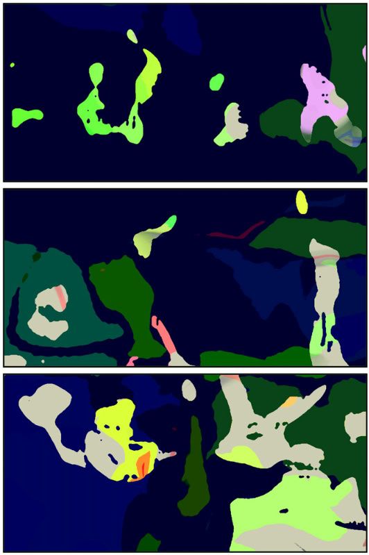
but that is only one surficial quick observational imprint, upon further inspection the piece gains a cartographical aspect (perhaps implanted in my head from your recent geographical works), but it's almost as if they were landmasses, bordering countries, bodies of water,
and then another aspect, that of klecksographie : i see things like a full wingspread eagle, a laughing happy fish w/ pinkstripe eyeball about to eat a fried chicken drumstick, a likeness of that famous face/vase optical illusion, a skull, a kiwi bird, a example of Gaudi architechture, a cute bambi-like deer head, a scene from Finnegans Wake involving the washerwomen, a biomorphic wordballoon indicitive that indeed language is an entity unto itself, an elephant wearing a mask and an upside down gun -- those are only a few,
and that in my estimation is why abstraction rules over representation -- purely retinal illustration approximates the thing as seen by the human eye, abstraction operates in the much more involved & elaborate area of cognitive processing -- giving the viewer complete freedom to create the piece for themselves, enabling the viewer to write the table of contents as they see it -- this gift i believe to be the most vital element of abstraction & the fact that you've presevered in your work against certain odds and sometimes hostile ignorance in the often one-dimensional comicworld --
earns you huge praise & respect in my little book,
carry my enthusiasm around with you like a stick of dynamite, for it is that explosive.
No no, don't be silly. All I meant was that stuff like "Ruins" or "24 x 24" I actually sweat over (well, at least figuratively speaking). These recent posts have been more like playing than creating... (Though maybe I'll put together a book of them at some point, I can see it work really well as phot silkscreens.) But I can see what you are saying about this color page looking like a map, and, actually, I used to do more map-inspired (non-comic) stuff back in the late nineties, as you can see in the third and fourth pics here. And please don't stop going all Clement G., I love Clement G.
I like this a lot. The forms are fairly minimal and the structure is a simple three-tiered "page," but the arrangement and shape of the figures is unexpected. The colors work similarly - there's just enough chaos in there to be really interesting.
"Andrei Molotiu's comics are absolute marvels: hotbeds of evolving ambiguity where one never knows what disturbing or witty interaction between abstraction of objects and objects of abstraction is about to take place. Each time I've opened them I've been utterly absorbed, that is, drawn into places where I had no power other than to become what I was looking at. What he does is superb." --Harry Mathews
"I love artists that break the rules and Andrei Molotiu breaks them all, with mind-bending and beautiful results." --Scott McCloud

5 comments:
excellent Andrei!
i hope you continue exploring this particular operation as i find it to be aces.
immediate association for this lookreader was Warhol's camouflage, due to color choice,
but that is only one surficial quick observational imprint, upon further inspection the piece gains a cartographical aspect (perhaps implanted in my head from your recent geographical works), but it's almost as if they were landmasses, bordering countries, bodies of water,
and then another aspect, that of klecksographie : i see things like a full wingspread eagle, a laughing happy fish w/ pinkstripe eyeball about to eat a fried chicken drumstick, a likeness of that famous face/vase optical illusion, a skull, a kiwi bird, a
example of Gaudi architechture, a cute bambi-like deer head, a scene from Finnegans Wake involving the washerwomen, a biomorphic wordballoon indicitive that indeed language is an entity unto itself, an elephant wearing a mask and an upside down gun -- those are only a few,
and that in my estimation is why abstraction rules over representation -- purely retinal illustration approximates the thing as seen by the human eye, abstraction operates in the much more involved & elaborate area of cognitive processing -- giving the viewer complete freedom to create the piece for themselves, enabling the viewer to write the table of contents as they see it -- this gift i believe to be the most vital element of abstraction & the fact that you've presevered in your work against certain odds and sometimes hostile ignorance in the often one-dimensional comicworld --
earns you huge praise & respect in my little book,
carry my enthusiasm around with you like a stick of dynamite, for it is that explosive.
salut !
.troy.
Thanks, but I don't know if I would really call them "geographical works"--I've just been selecting bits from Google Earth that look right.
pardon my pigeon-holing, it was lame of me to designate your works with flimsy labels,
i should just enjoy engaging w/ it & not go smartypants 'cause i tend to get near-maniacal frothing mode in an over-enthusiasm of outpourings.
i'll chill-out & lay off the Clement G. routine...
No no, don't be silly. All I meant was that stuff like "Ruins" or "24 x 24" I actually sweat over (well, at least figuratively speaking). These recent posts have been more like playing than creating... (Though maybe I'll put together a book of them at some point, I can see it work really well as phot silkscreens.) But I can see what you are saying about this color page looking like a map, and, actually, I used to do more map-inspired (non-comic) stuff back in the late nineties, as you can see in the third and fourth pics here. And please don't stop going all Clement G., I love Clement G.
I like this a lot. The forms are fairly minimal and the structure is a simple three-tiered "page," but the arrangement and shape of the figures is unexpected. The colors work similarly - there's just enough chaos in there to be really interesting.
Post a Comment